


Back to the wild web
Vote for Readymag's Websites of the Year

This newsletter is sponsored by Readymag. Readymag Websites of the Year is an annual award that showcases the gems of web design. All of the nominated websites were made with Readymag. Read on to see my favorite nominees of this year!
Does anyone of you remember Geocities or all the other random website builders from the early 2000s?

One of my favorite memories when thinking back to the many, many hours I spent online as a tween was the vast amount of weird, creative websites that I stumbled upon and that I created myself with code snippets found anywhere and everywhere.
Browsing websites felt like wandering through a maze of hysterical GIFs, sound that came out of nowhere and was impossible to turn off, ridiculous website navigation and the most hideous color combinations known to man. Bonus points if you managed to mismatch your text color and background color in such a way that no one could read the contents of your website.
Websites today are in many ways are better than those websites made with Geocities or other old website builders. We follow best practices, strive to keep things simple and easy to digest, make sure websites are accessible and responsive. Websites are overall easier to set up and manage thanks to templates, design systems and standardisation. Predictability, making content easy to scan and avoiding cognitive overload make it easier to manage the content overwhelm so many of us experience.
As a consequence everything looks the same.
Same grid layout. Same sans serif typography. Same white box.
We’ve already seen movements like Antidesign protesting the boring websites we see today by putting fun over function. Embracing vibrant colours, free-form layouts with overlapping elements and bold typography. Antidesign overall challenges UX/UI standards. It critiques the commodification of web design and questions why the focus should lie on user-friendliness and usability instead of creativity.
Sometimes I feel nostalgic for those early internet days that felt like the wild west. It makes me wonder if we can inject some of that creativity and joy back into web design without giving up on user-friendliness and usability.
Luckily we have platforms like Readymag. Readymag allows me to tap into that nostalgic feeling of building websites when I was 12 whilst also making sure the stuff I build is actually user-friendly and will not give people an epileptic seizure.
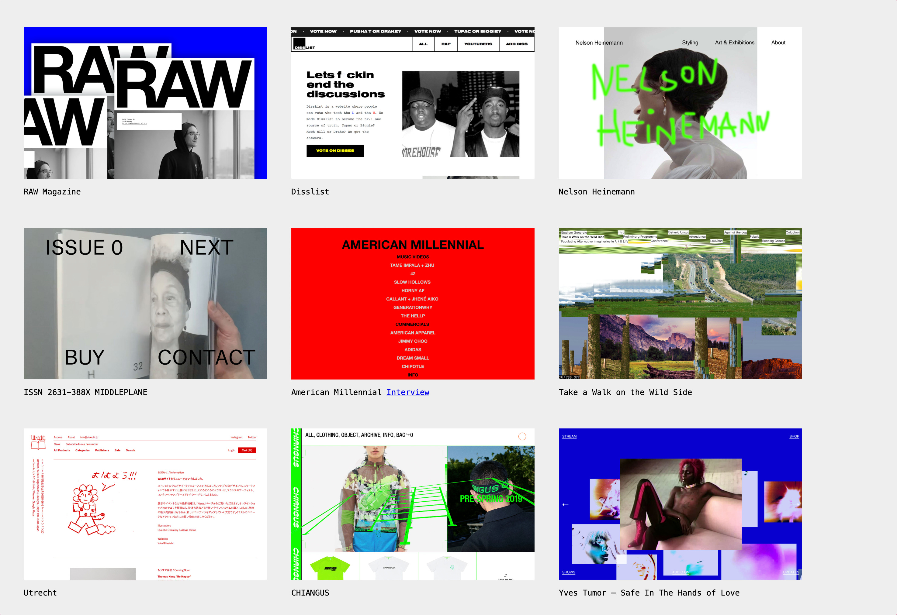
Readymag Websites of the Year
This year Readymag is organizing the Readymag Websites of the Year, an annual award that showcases the gems of web design. Of course, all of the nominated websites were made with Readymag.
Scroll down to see my favorite nominees!
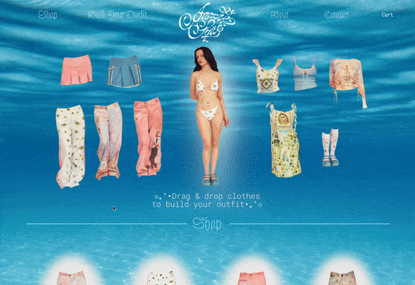
Ughhh so pretty and creative! This really reminds me of the hours and hours I played Styledollz online. Please take a look at the rest of the shop too, the details are 🤌

I love the bold use of typography here and how that can be a stylistic element on it’s own. The hover effect with the images gives it a nice pop of colour!

Simple but leaves a lasting impression - the kind of portfolios that go straight into my “Inspiration”-folder.
Readymag Websites of the Year is an annual award that showcases the gems of web design. All of the nominated websites were made with Readymag - go and vote on your favorite website over here (or steal some inspiration!)